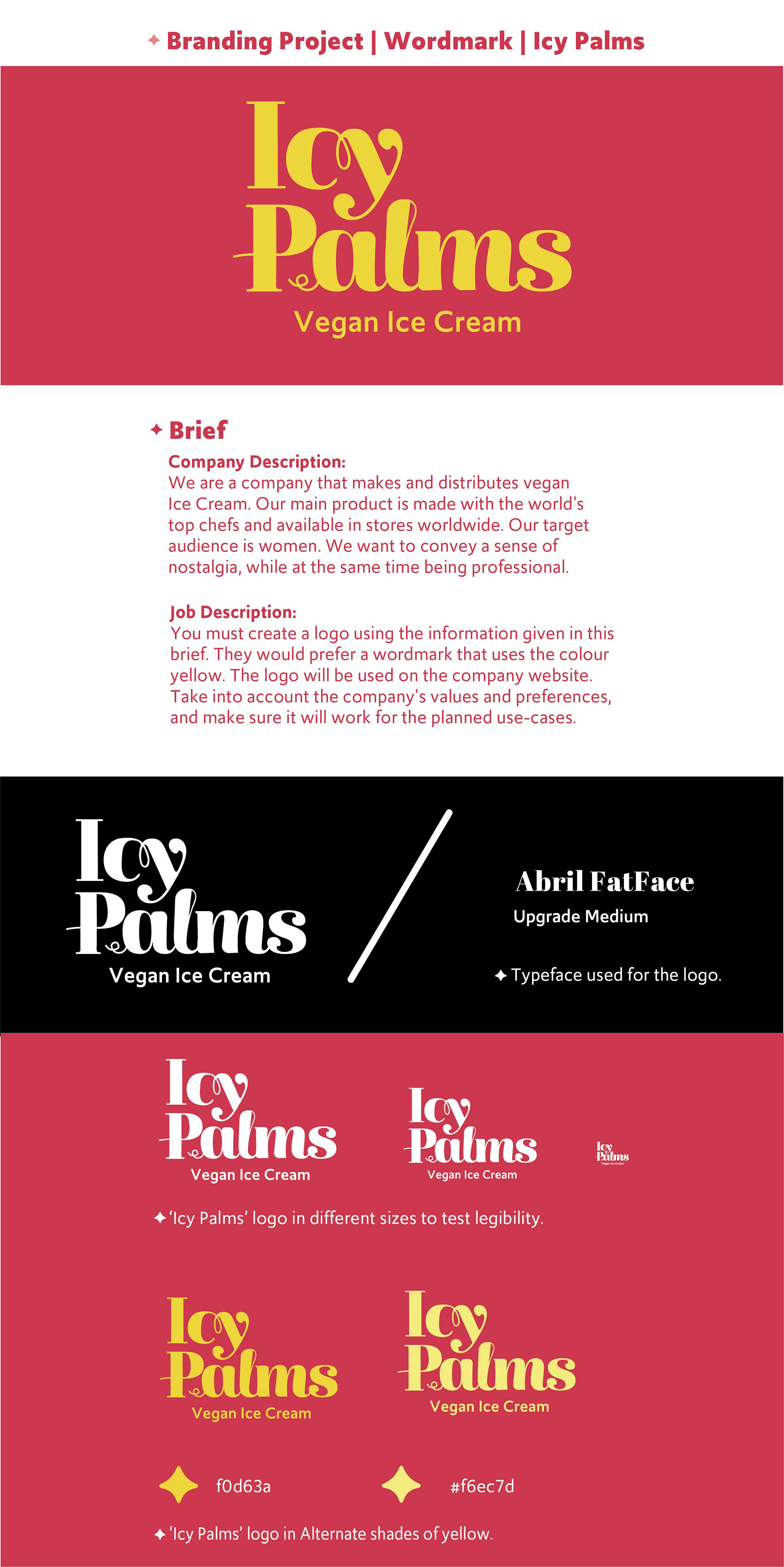
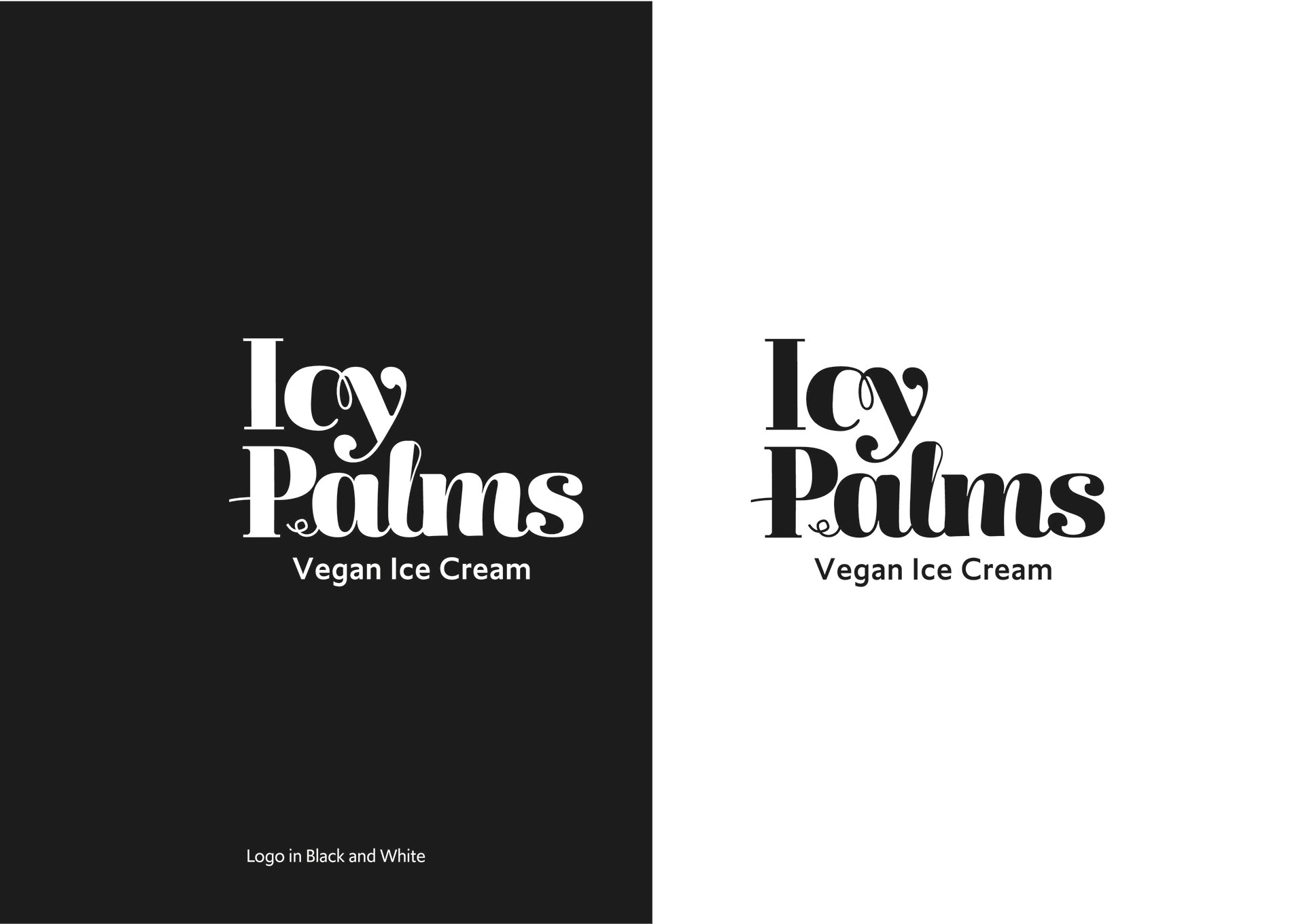
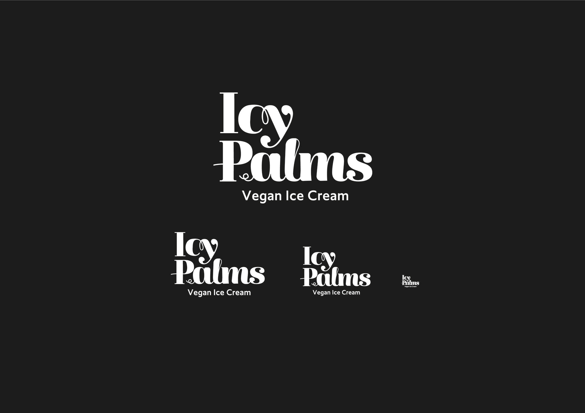
Logo in Black and White and in different sizes to test wordmark visual strength.
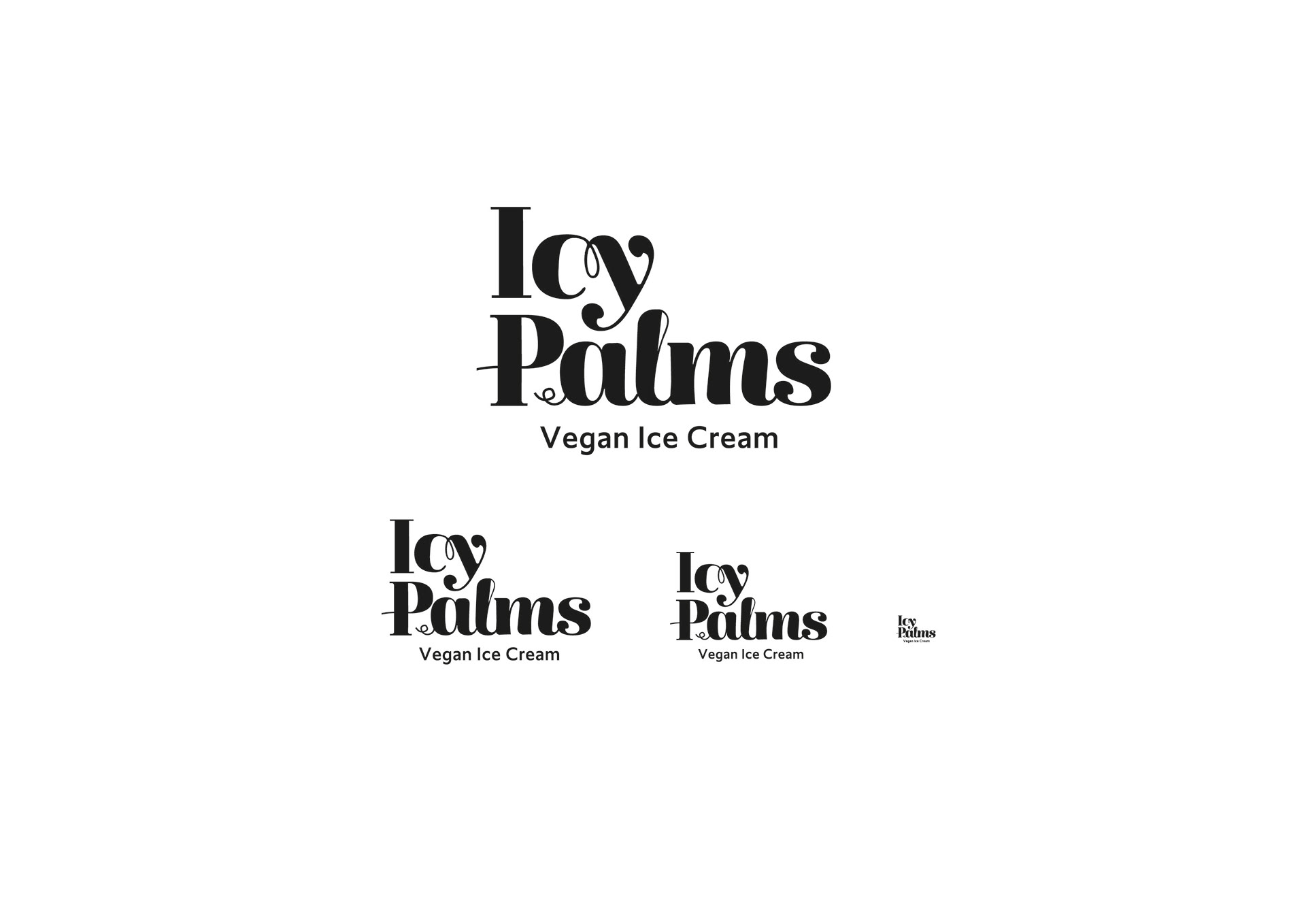
Different sized logo to test legibility.
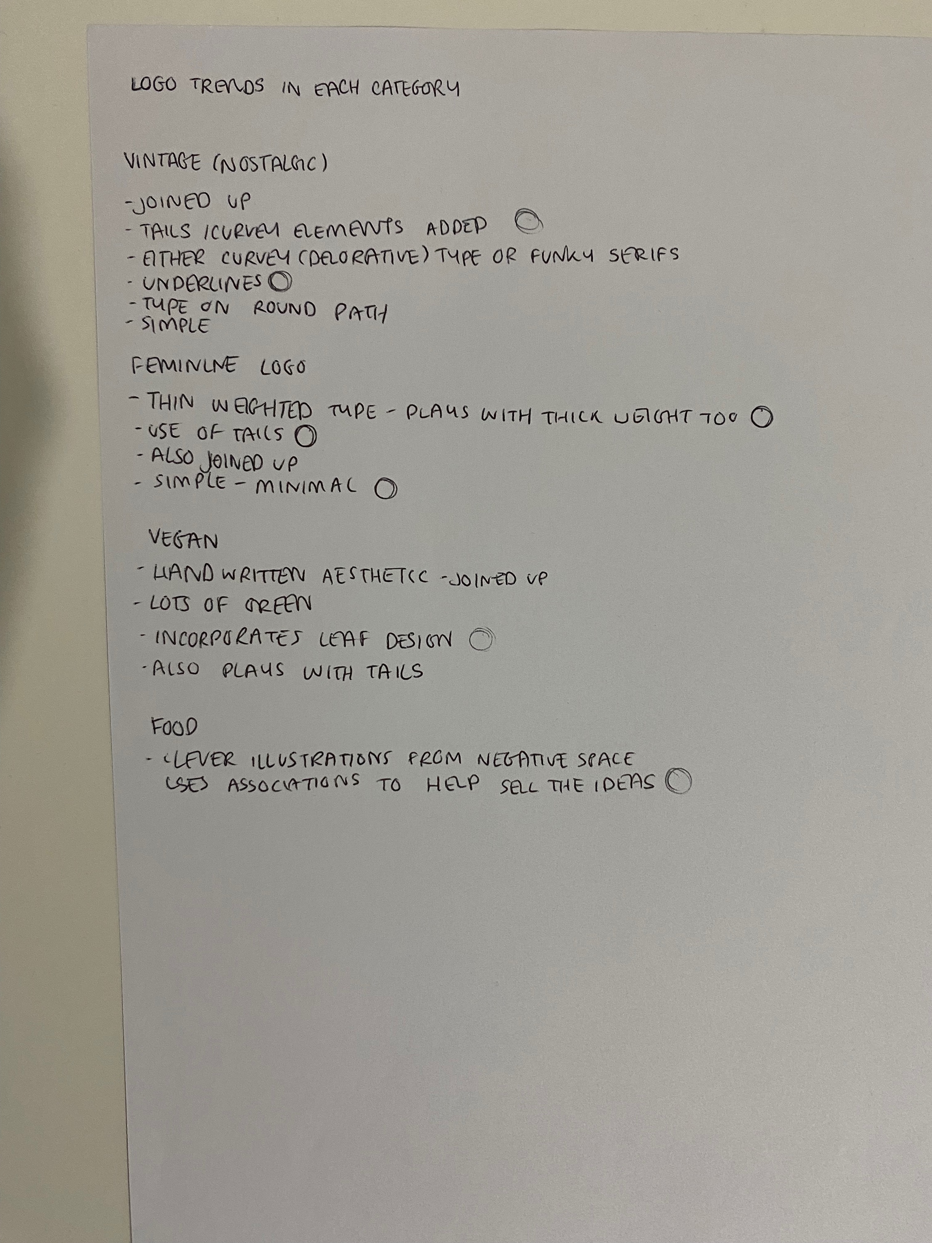
Development of the logo design came from starting listing the requirements and characteristics found in each important aspect of the logo- from the style (nostalgic/retro) to the intended audience (women) to the type of product (Vegan)
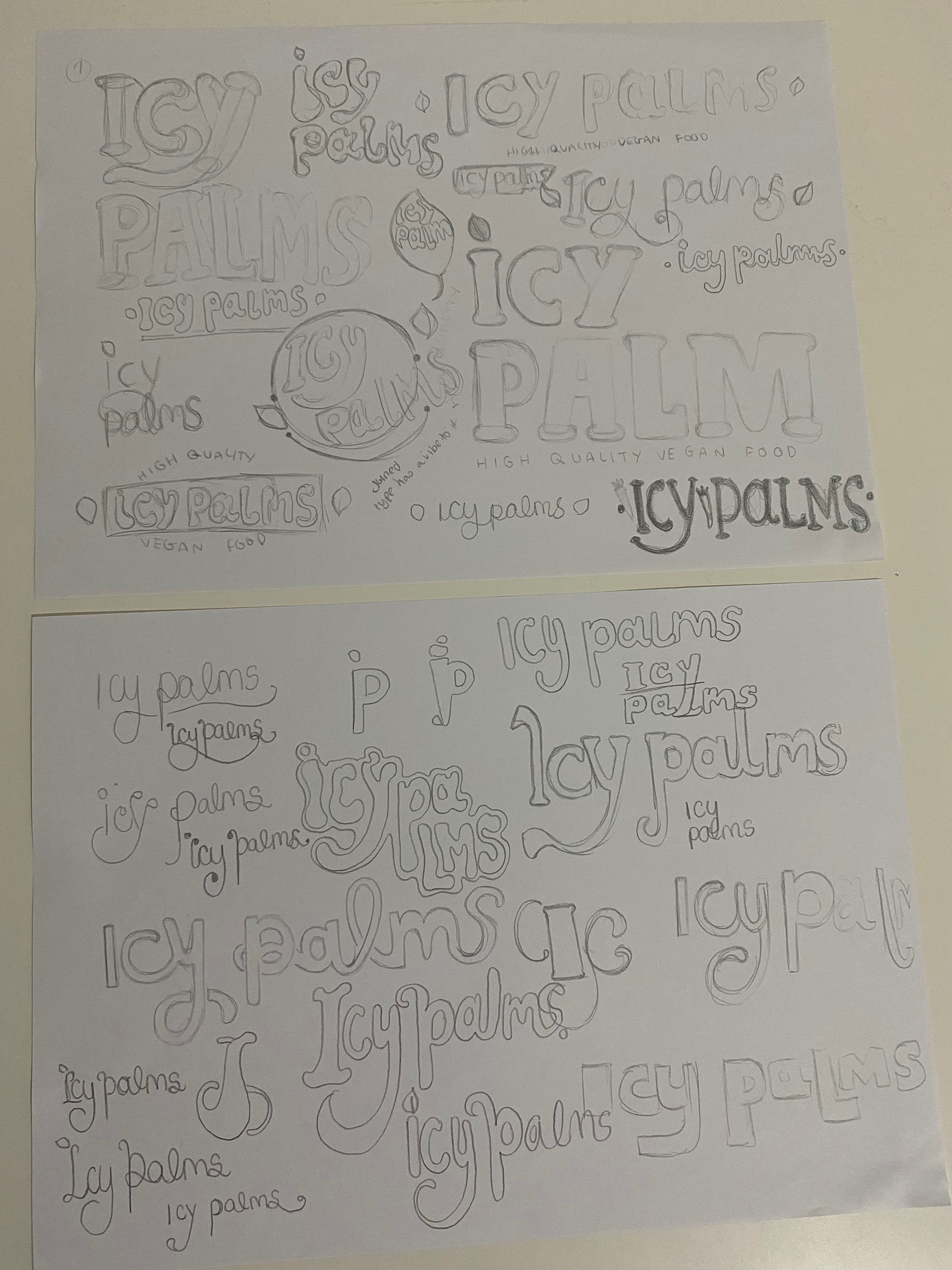
I would then create mood boards to help give the project some basis and begin drawing potential ideas or entry points my logo could follow to take shape.
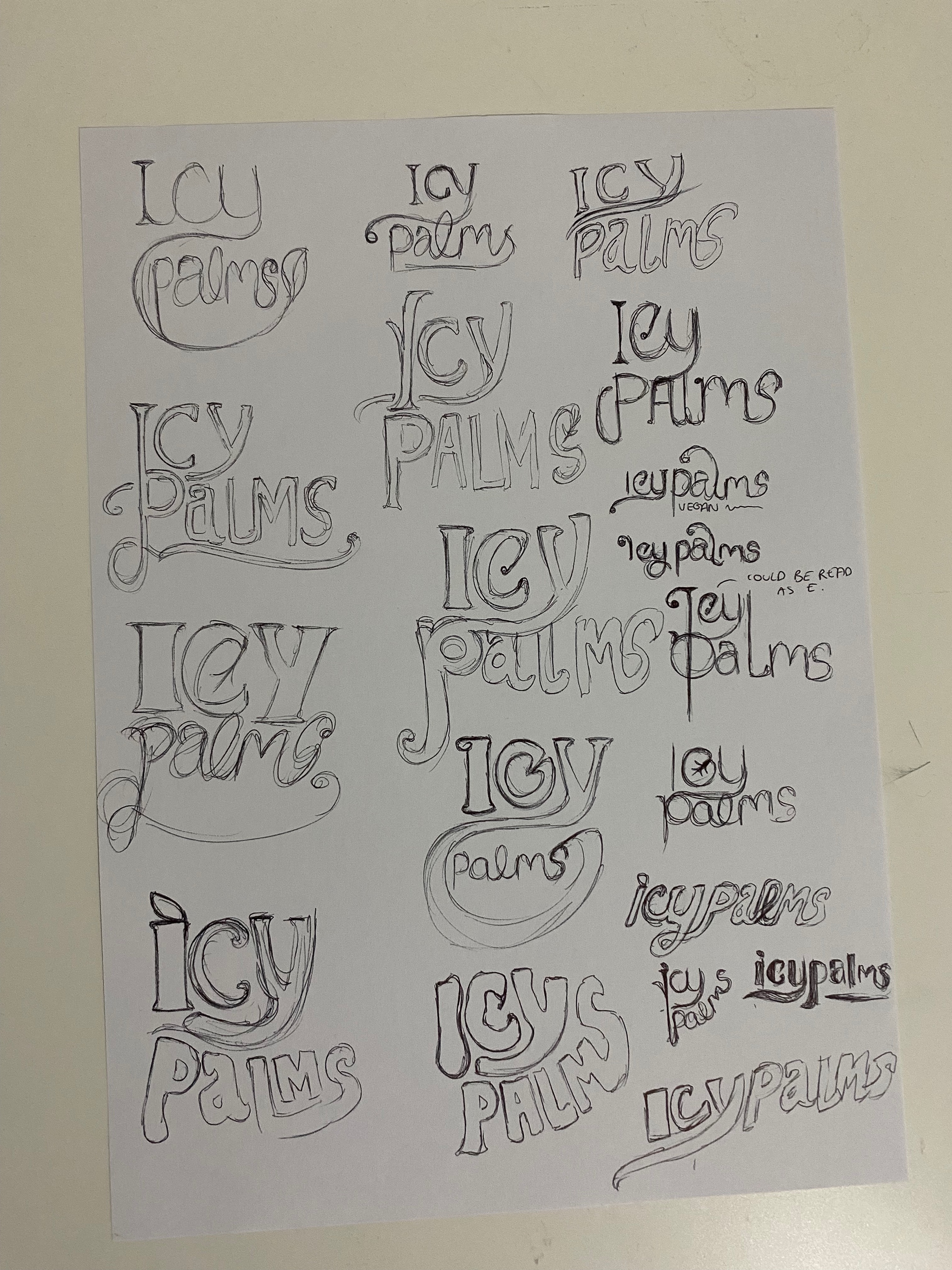
I then took a design I liked the idea of and tried to experiment with it in Adobe Illustrator. However not liking the current designs I began to get more simpler approach, and used a font which I would manipulate.
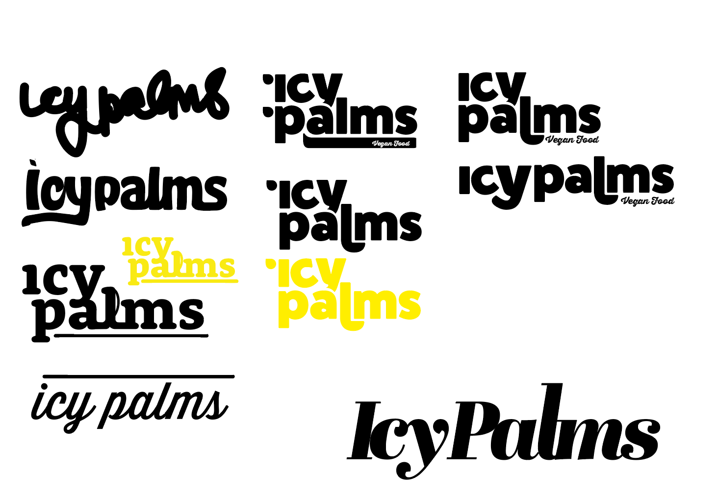
It was then I started using the Abril FatFce font as I felt it had the nostalgic, classy and feminine Vibe I wanted, so I played with little elements; like adding in tails on the Y letter that would become underlines, to the placement of each word, joining up letters.
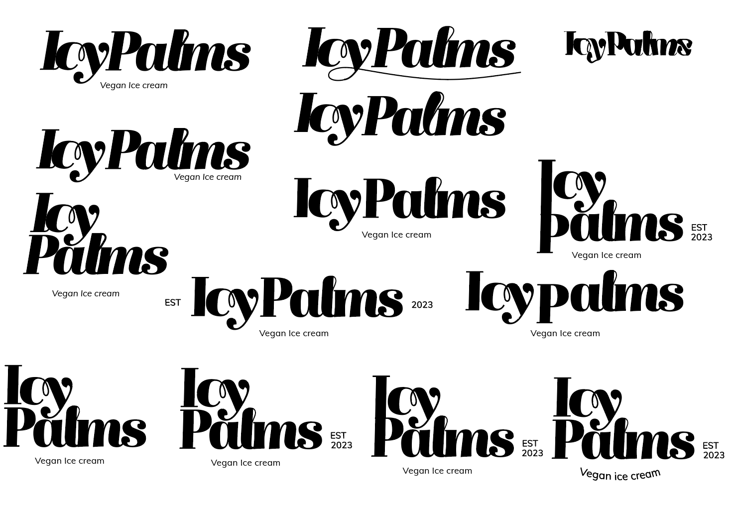
I got to a point where I liked the overall design of the logo but extra elements could be added to give it more flair.
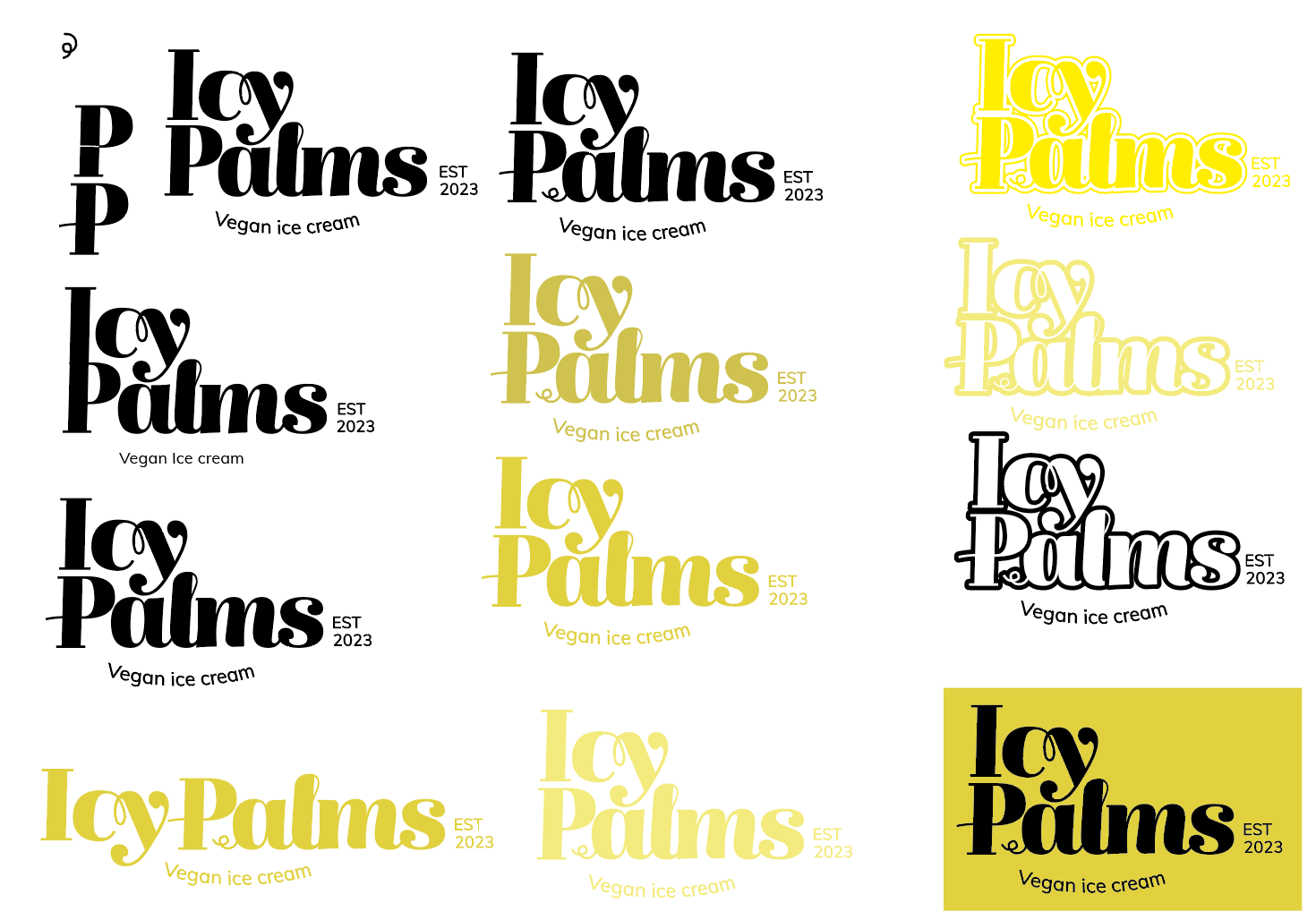
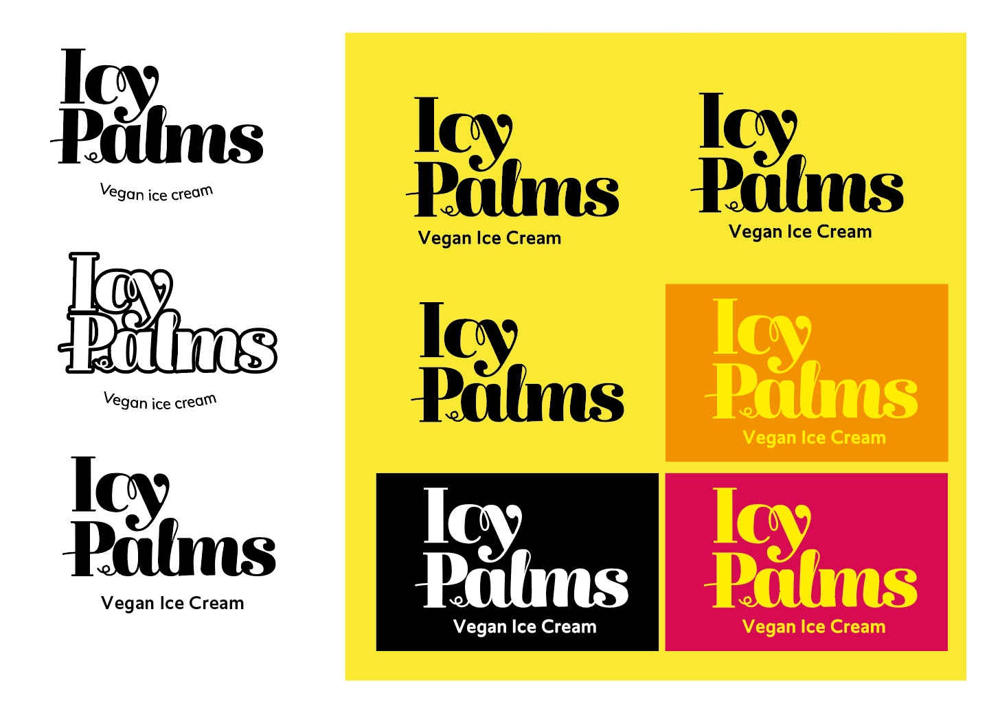
I also updated the tag's font as well as its overall layout and tested colours.